Website Building
Everything web -
Brief
To develop an online identity in the form of a website portfolio, expand my skills in css/html and to showcase my projects so far in a way that shows my personality and design persona.

Style choices -
Choosing colour and font face
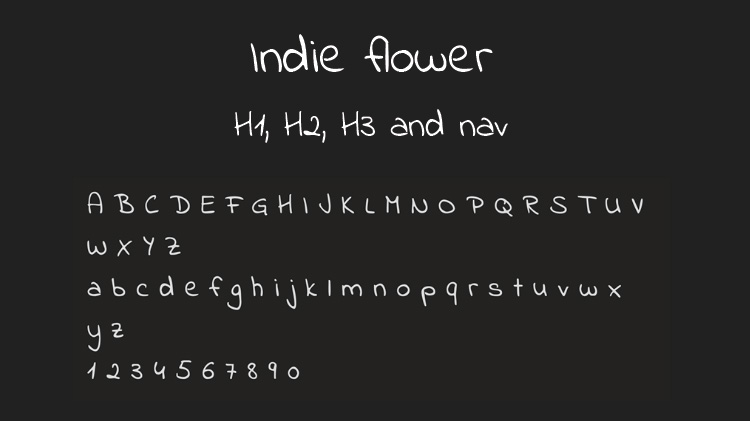
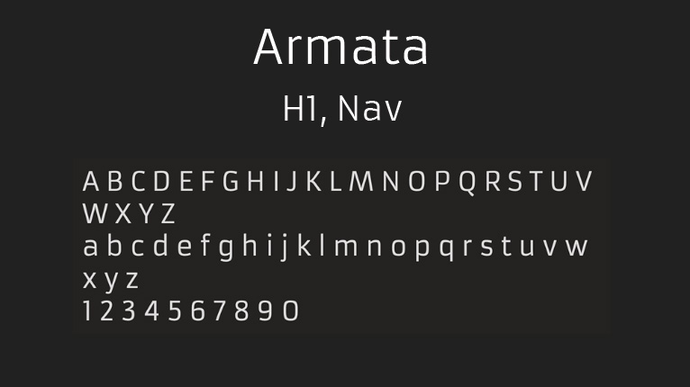
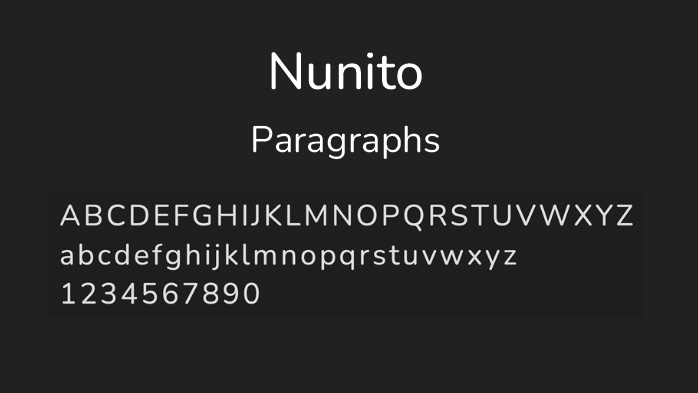
To start my development of this website I needed to decide on the fonts, I selected three key fonts. Indie Flower is the obvious variable within these but I like this as this represents my love for drawn elements of graphics. The other fonts I decided on are more formal, for navigation and text to help legibility.
My background colour of light pink, with an accent bright pink brings out more colour within my portfolio. I introduced dark purple for 'title areas' as a replacement for black as some layouts contain darker themes and I did not want to wash out my images.
Wireframe and user navigation
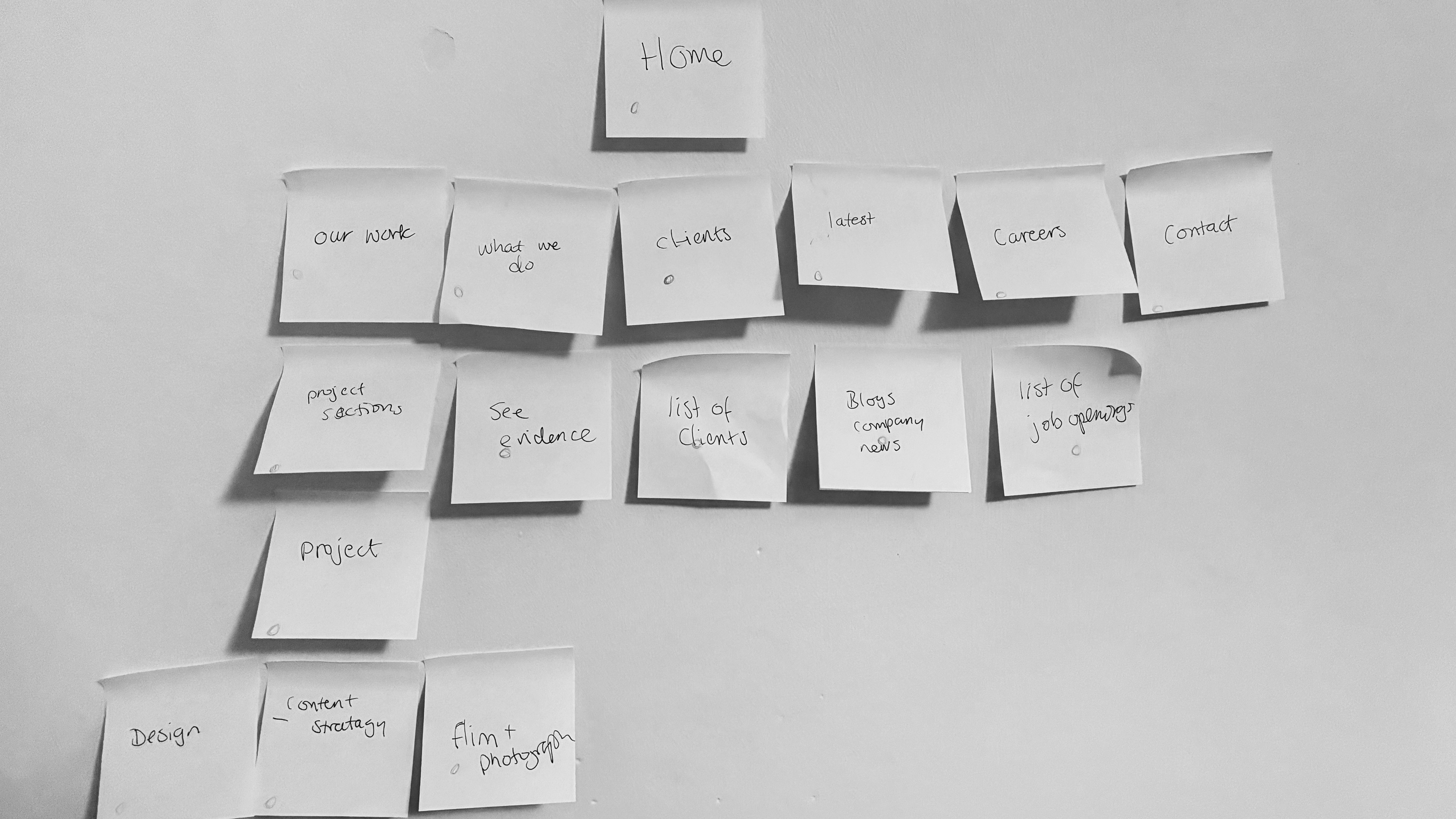
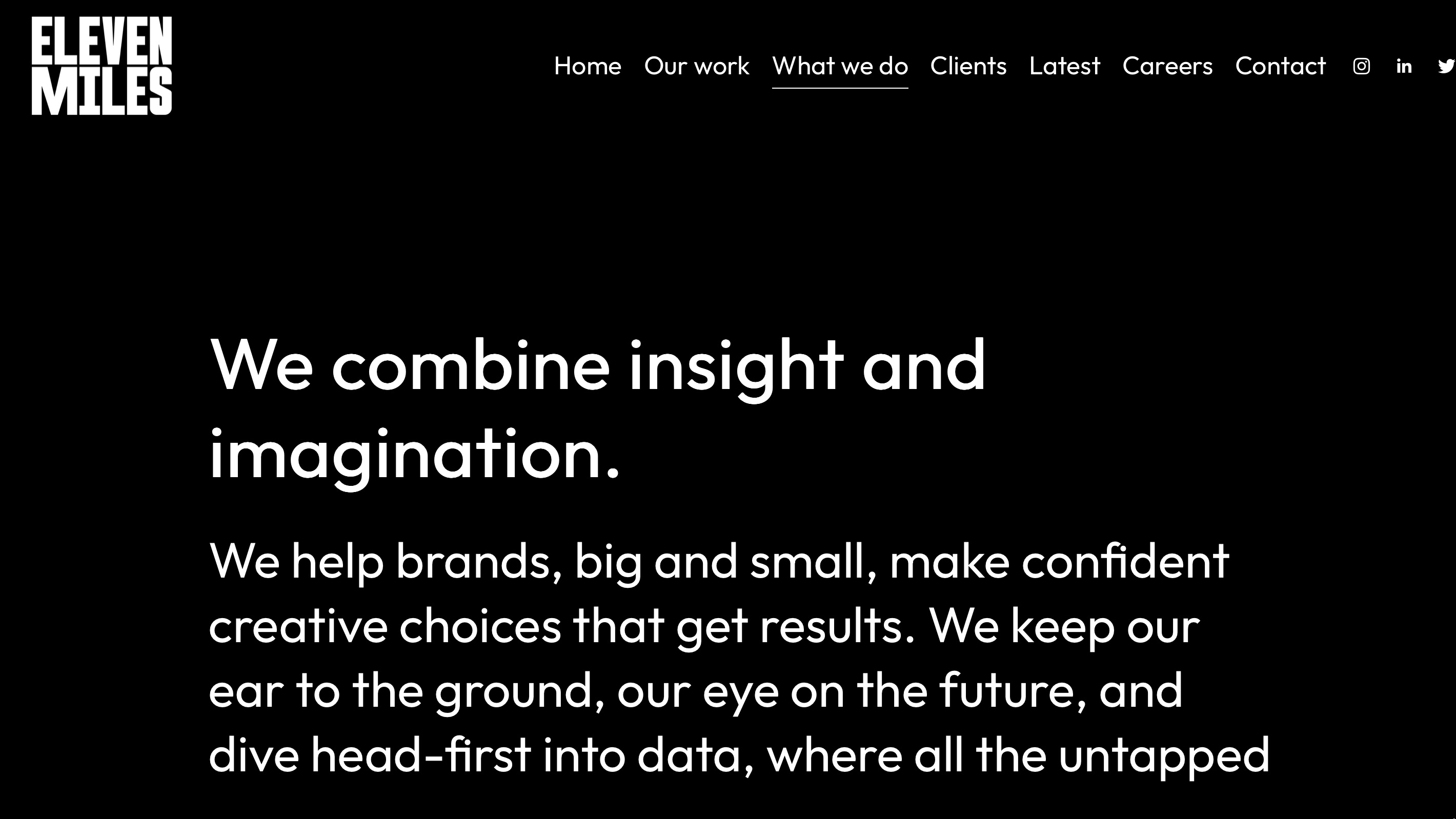
Developing my awareness of user navigation I explored wireframes of current design studio websites.
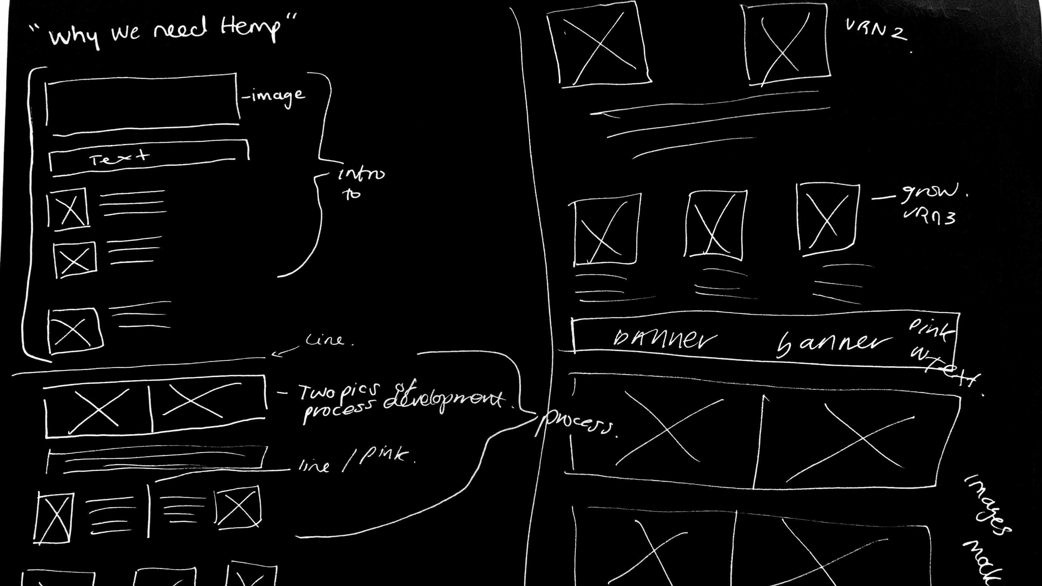
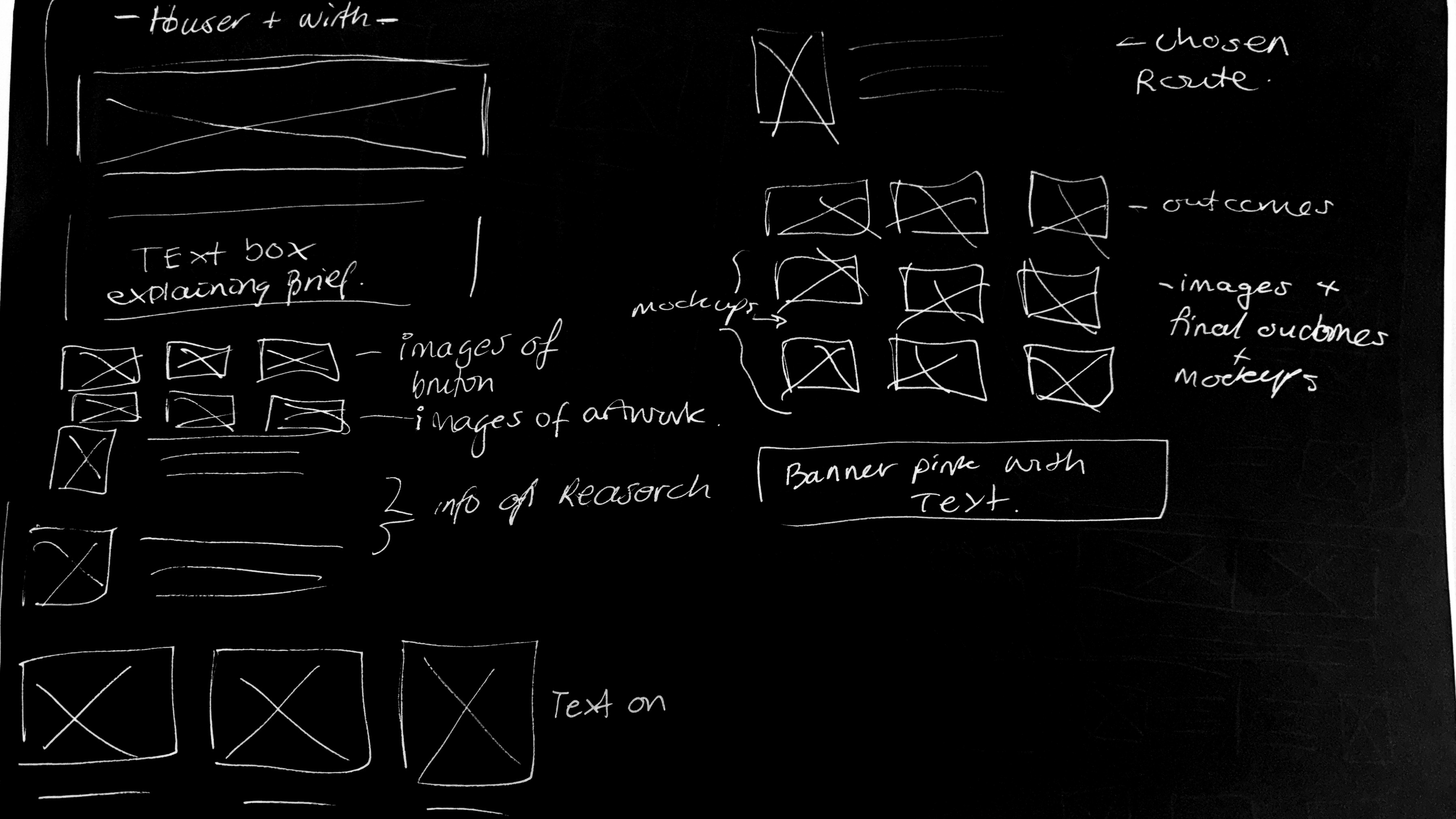
Looking at Eleven miles website encouraged me to develop my own wireframe and design layouts for projects, this accelerated my coding process as I understood the direction of aesthetic my portfolio would take.
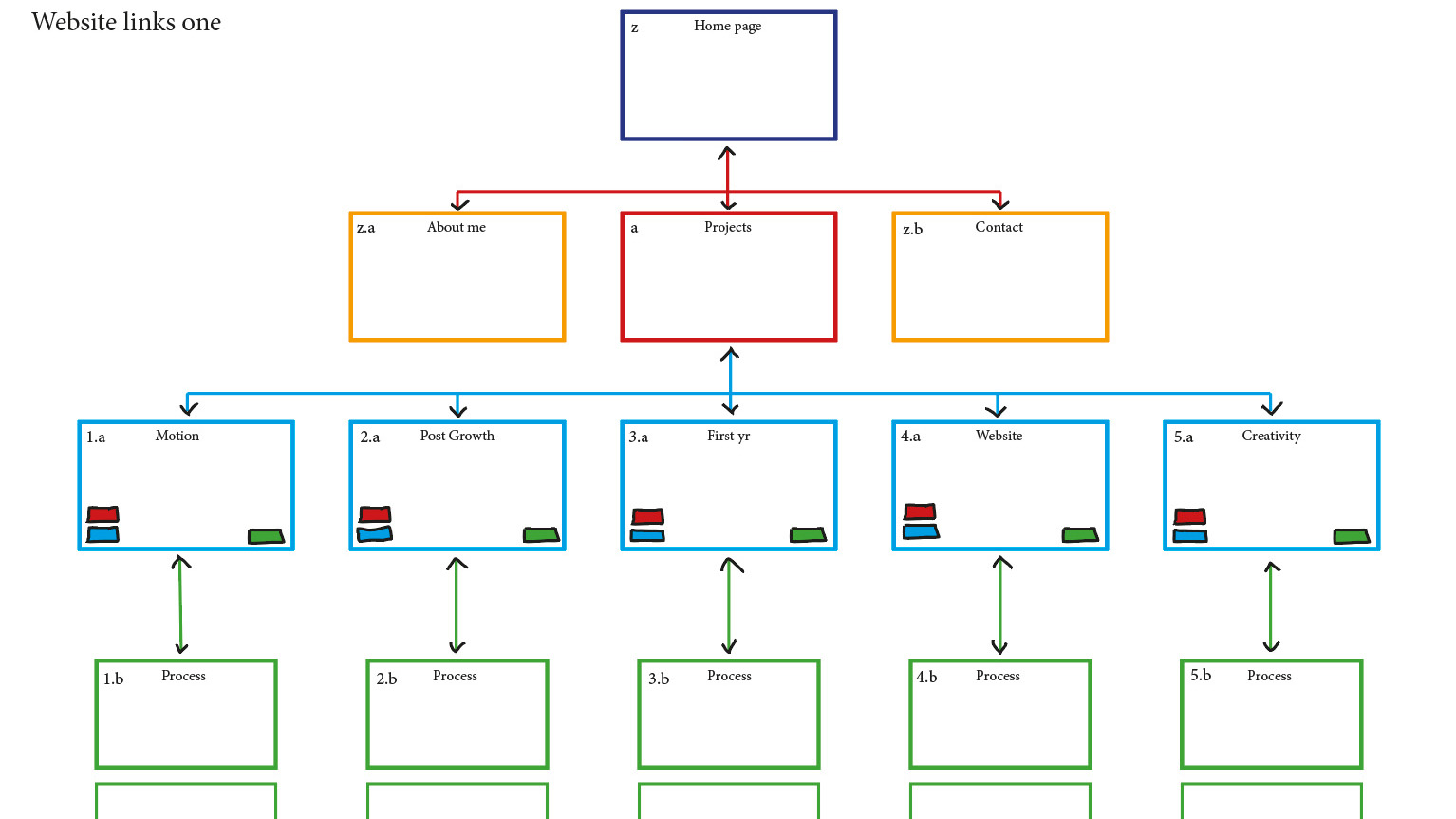
Through wireframes I was able to link this to the ease in which users would navigate my portfolio. I wanted to try and have an element of simplicity to my web, I believe this aids my project storytelling of process.
Enhancing user experience -
User testing
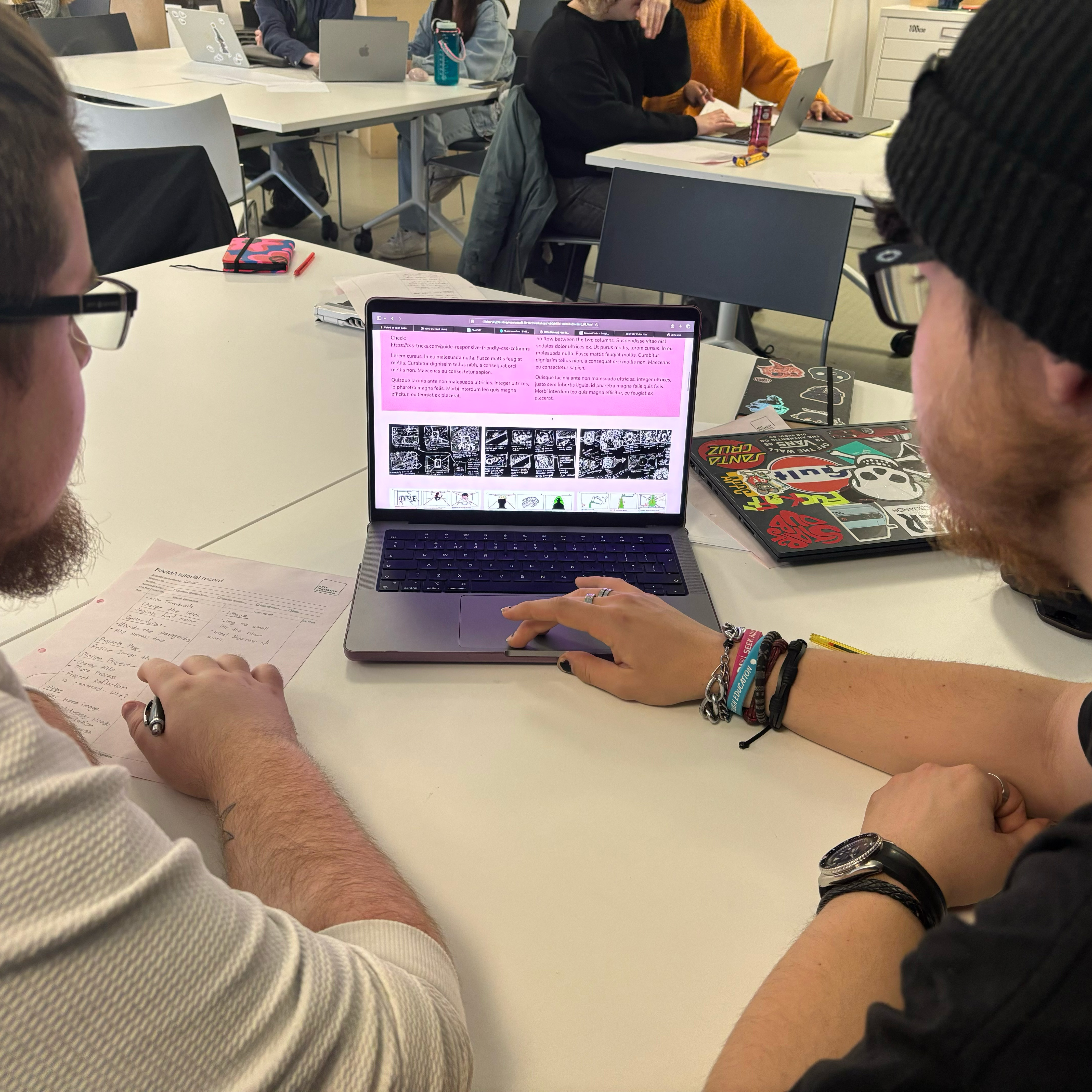
The main feedback points I got from the users who tested my website was; staying consistent, adding a back to the top button and making sure my titles match.
From this feedback I have created a back to the top button for project pages, this has made a huge difference in navigating between links. I have also changed titles and paragraphing to try and make the text more consistent and easier to look though.
Carbon footprint rating
Important to my moral values from a design perspetive I have aimed to keep my portfolio low impact on website carbon.
At the end of my designing of my portfolio I tested my my website. Where I received a rating of A+ on carbon rating this was checked with WebsiteCarbon.com
Reflecting on my portfolio
My goals when building this website were to show how proud I am of my past projects and the skills I have developed as a designer, whilst displaying my personality and graphics ability.
Coming into this project I had no experience within coding. However, I have found that following the workshops has given me the ability to explore a new skill. Changes made to the css show my personality through my website and hopefully encourage employers to explore my website. I have shown my projects from start to finish to help users experience all of the challenges and design choices before final outcomes, this makes my website more intriguing. Some of the changes I’ve implemented include font choices and names of sections that fit my projects to make them more fun to read.
I have found that code is both rewarding and challenging, there are elements of my website that I haven’t been able to change which has been frustrating. But, I have enjoyed exploring the ways things can change through a single added or deducted element within the hdml / css. I have found laying out my website has been challenging when it comes to choosing which code to implement and where to place it.
Overall, I am happy to have something to share with people when they ask about my work, I think this is a great tool to have to help me further my graphics journey when looking for internships and work opportunities.