Why we need Hemp
Post Growth Project -
Brief
To create an alternative to concrete in a post growth world, this was a brief with Imagination a London based studio
Collaborative project with Oona McLeary, Steph Ramalhete and Umika Maharjan.
Key Insights
The widespread use of concrete in urban development has led to significant environmental and societal challenges, highlighting the urgent need for sustainable alternatives in construction and urban planning. Going into our chosen idea, we decided to focus less on targeting these hempcrete houses to those with respiratory problems but have it as something that benefits everyone.
Imaginary
In our future imaginary, we aim to invent new habits, experiences, relationships, and interests in the absence of fossil fuels. All the designs have been developed to coexist with the environment. In this imaginary world, concrete will no longer be produced, so we aim to reuse products and materials that we already have whilst also considering alternatives.
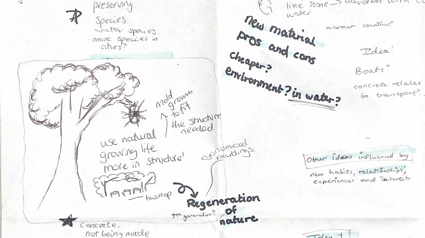
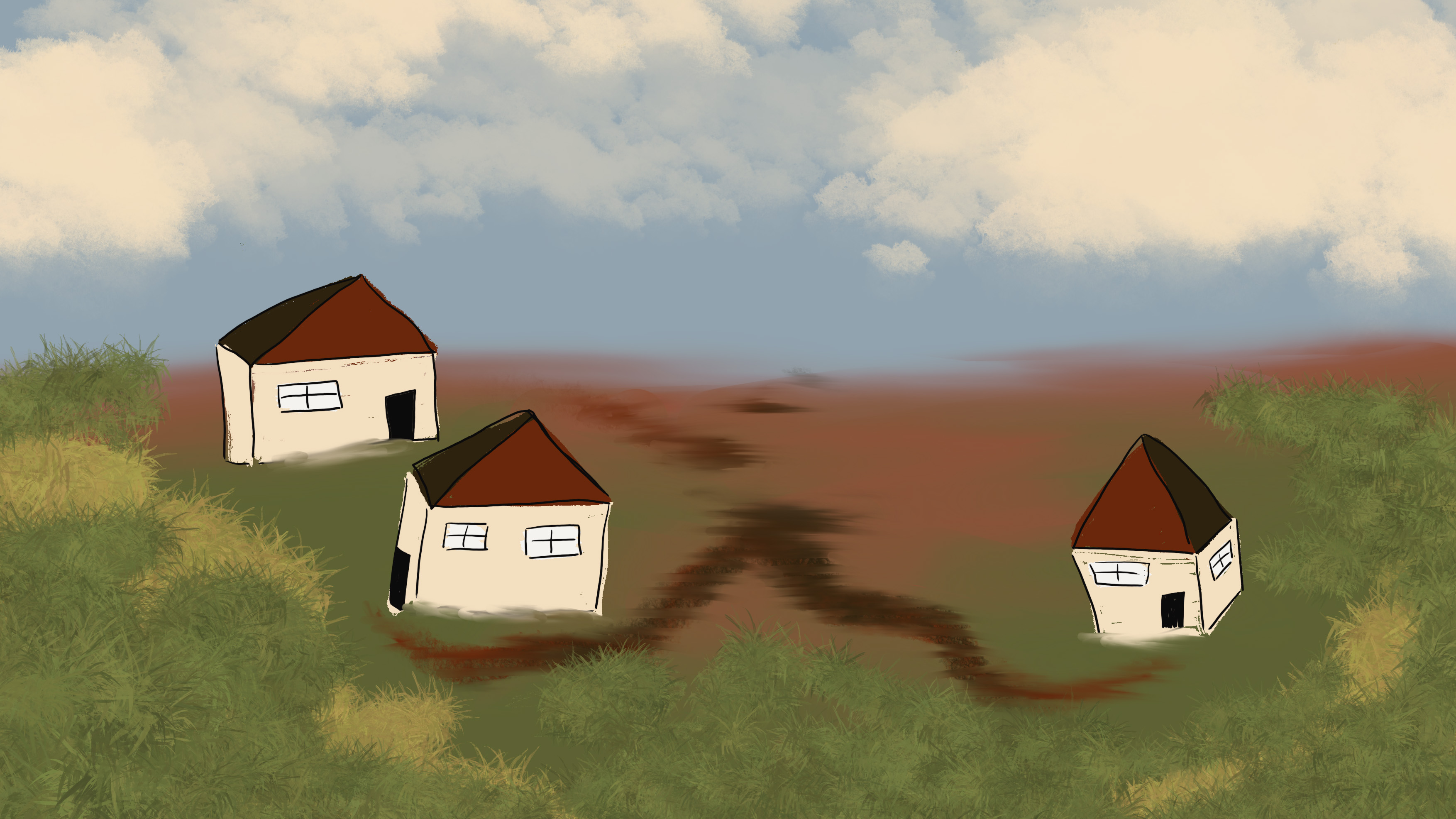
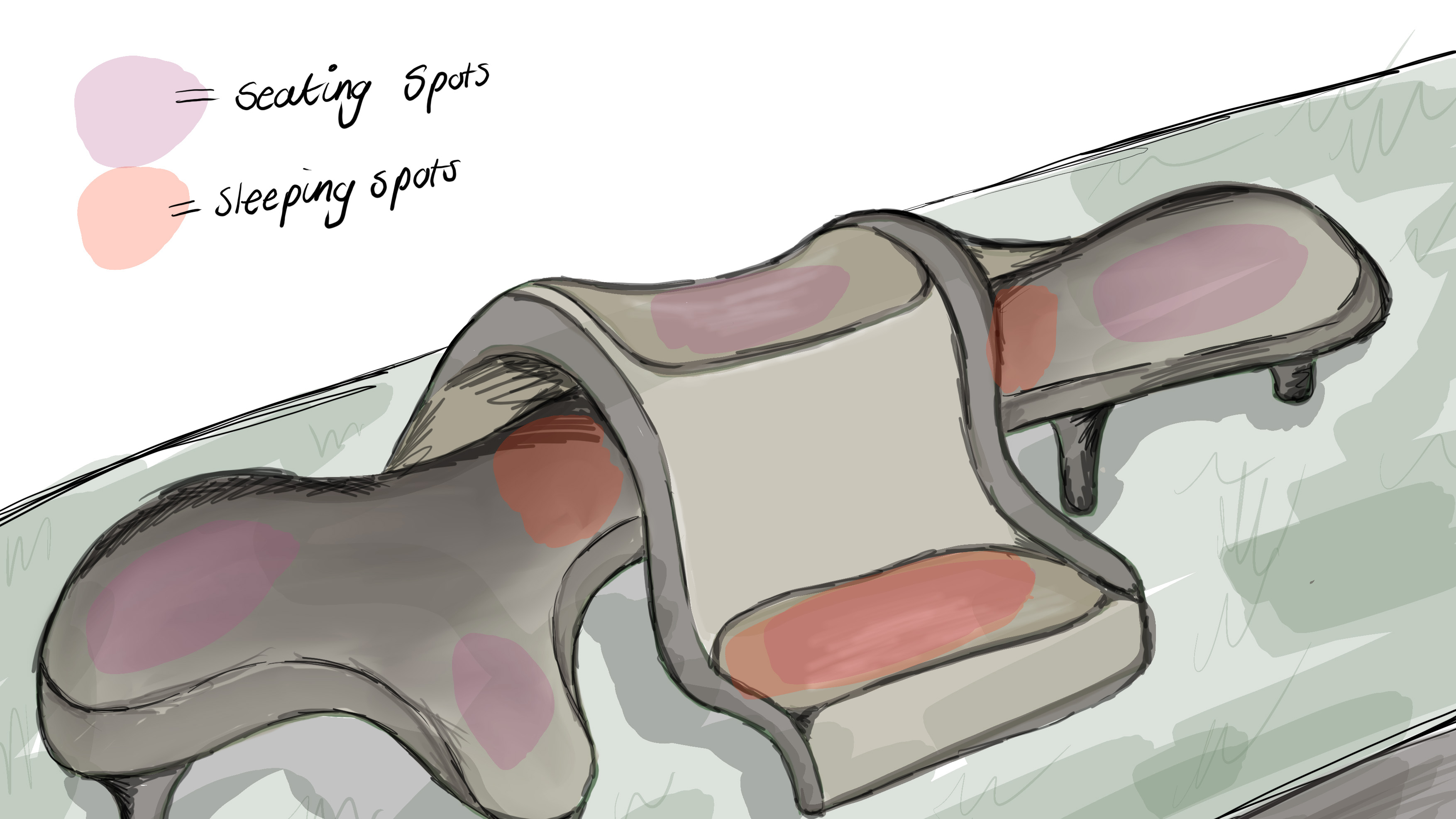
Generating ideas
I had three routes that I researched from initial development on the starting brief. My first idea was repurposing concrete into positive homeless benches, using old concrete to create structures that would benefit both environment and people.
My second idea was to implement 'thirsty concrete' into high flood areas This concrete focuses on absorbing water quickly draining it into the soil beneath.
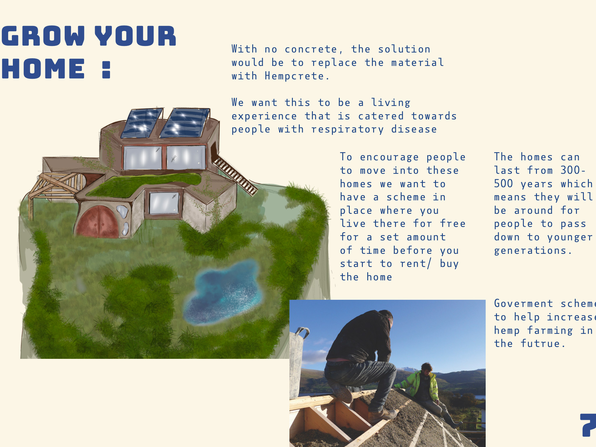
My final idea was around creating Hempcrete homes I wanted to replace concrete with Hempcrete. The planet would benefit from the reduction of concrete and not only that but hemp can be used in many manufacturing alternatives.
Exhibition showcase
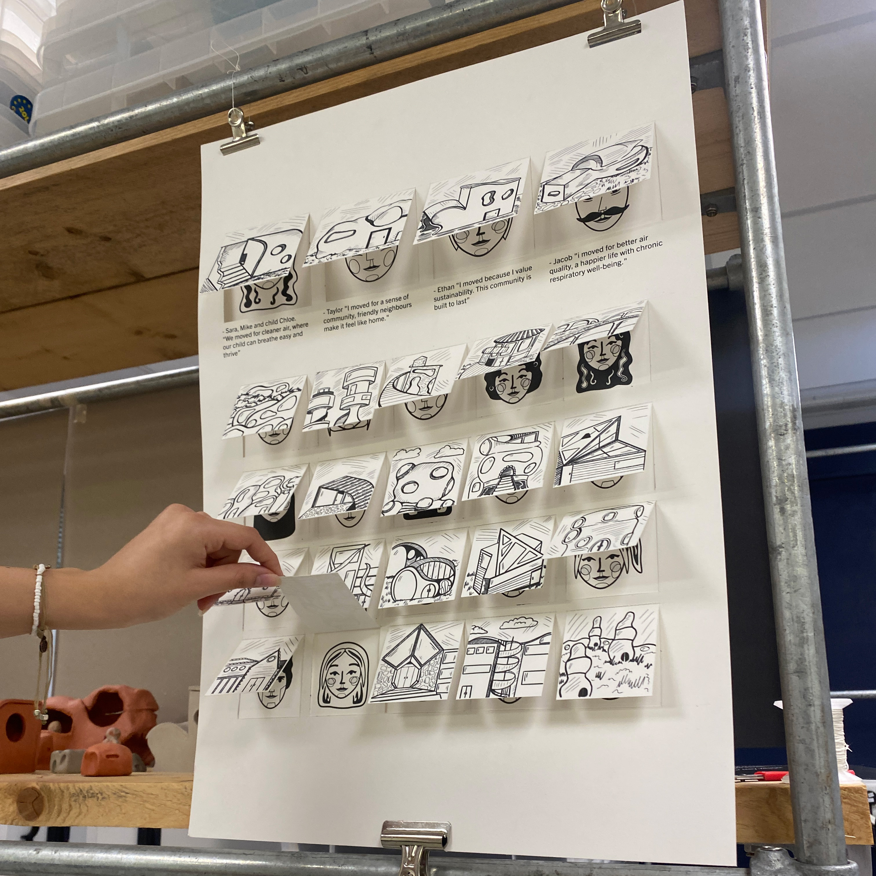
For the exhibition we had to develop a physical represntation of our chosen idea, we moved forward with my hemp homes combined with Umika's idea of hemp farms.
We wanted to push these ideas forwards since they cohisive in our aims to replace concrete and made the idea of hemp homes stronger.
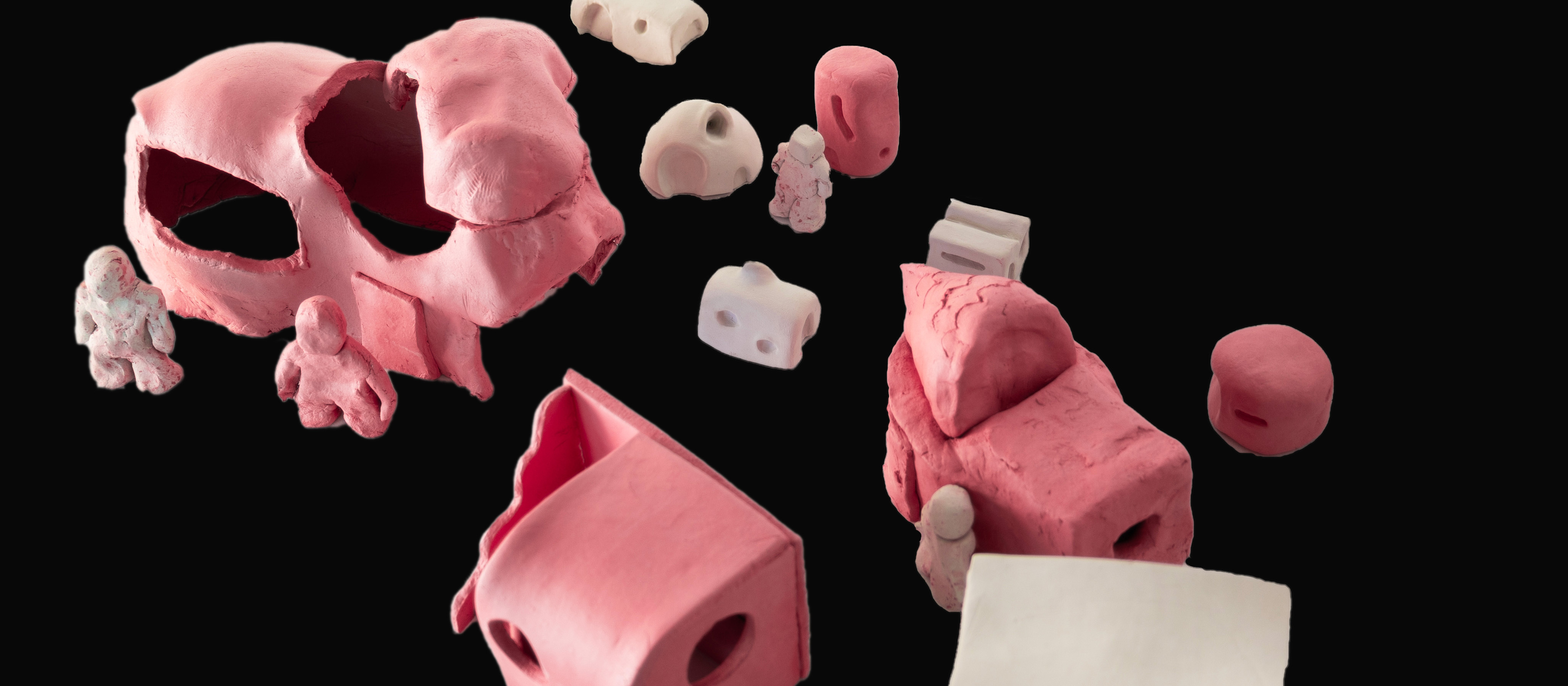
Building clay houses
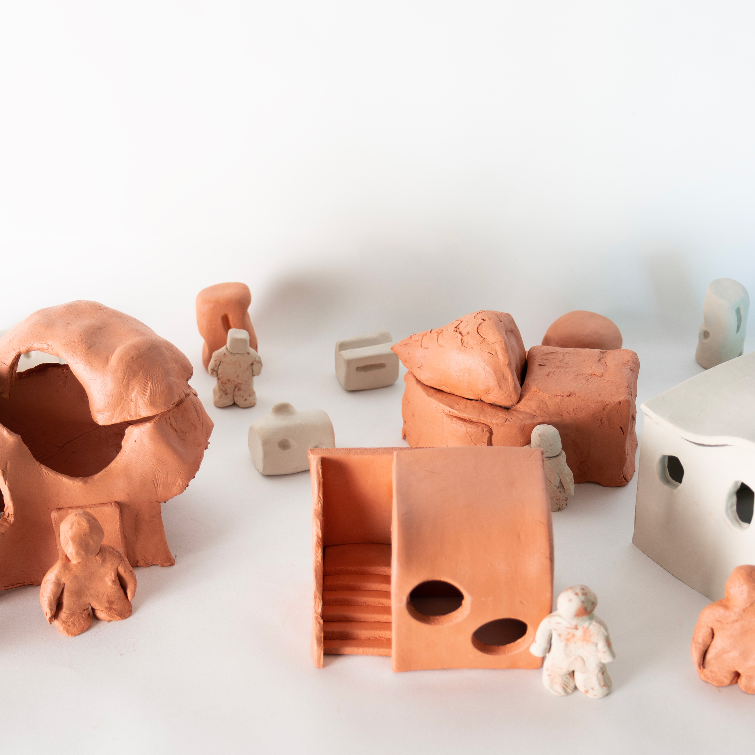
Our final exhibition is to show the target audience we are aiming at, who have sense of community and want health benefits of moving to a low c02 atmosphere.
We had a poster design of homes with people inside, some stating reasons they would move to Hempcrete architecture. Joined with mini clay homes with little clay people.
Pictures of the showcase together
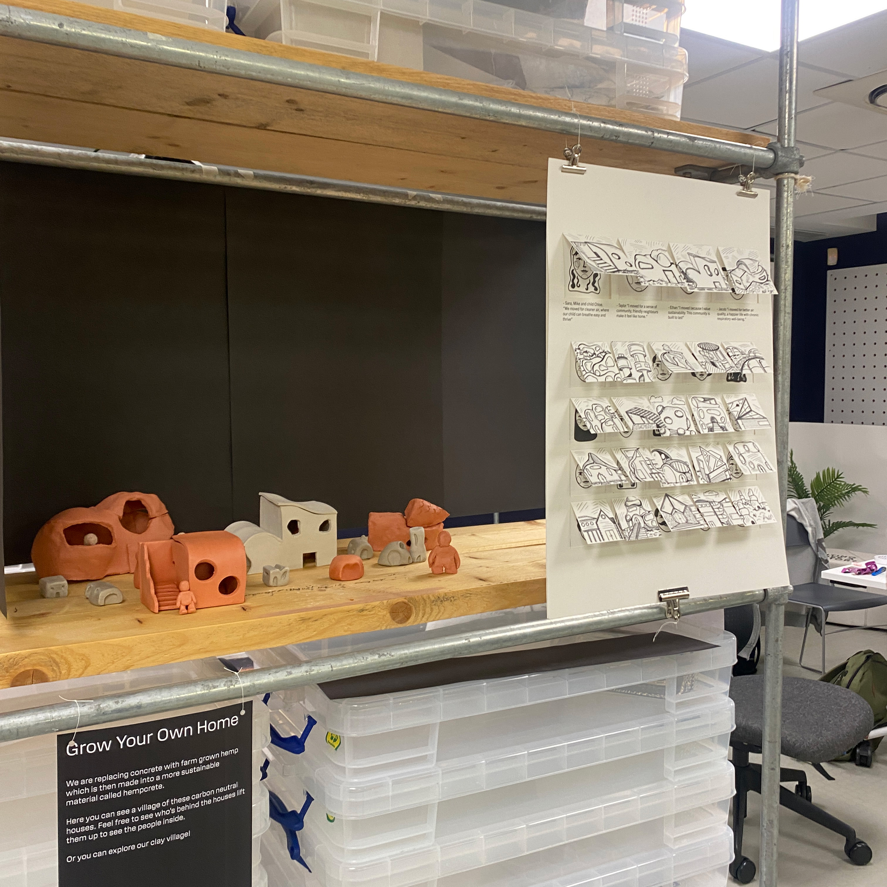
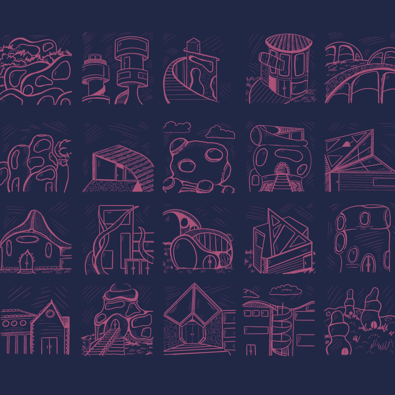
My part in the exhibition was to design multiple sketches of homes, all of them varied between abstract or modern architecture. The variety was to allow people to imagine a future with a difference, or imagine a home with benefits .
I also helped with making the clay homes, each person from our team developed their own clay house. Again with the ideas to show the possibilities of Hempcrete and to encourage people to imagine the change.
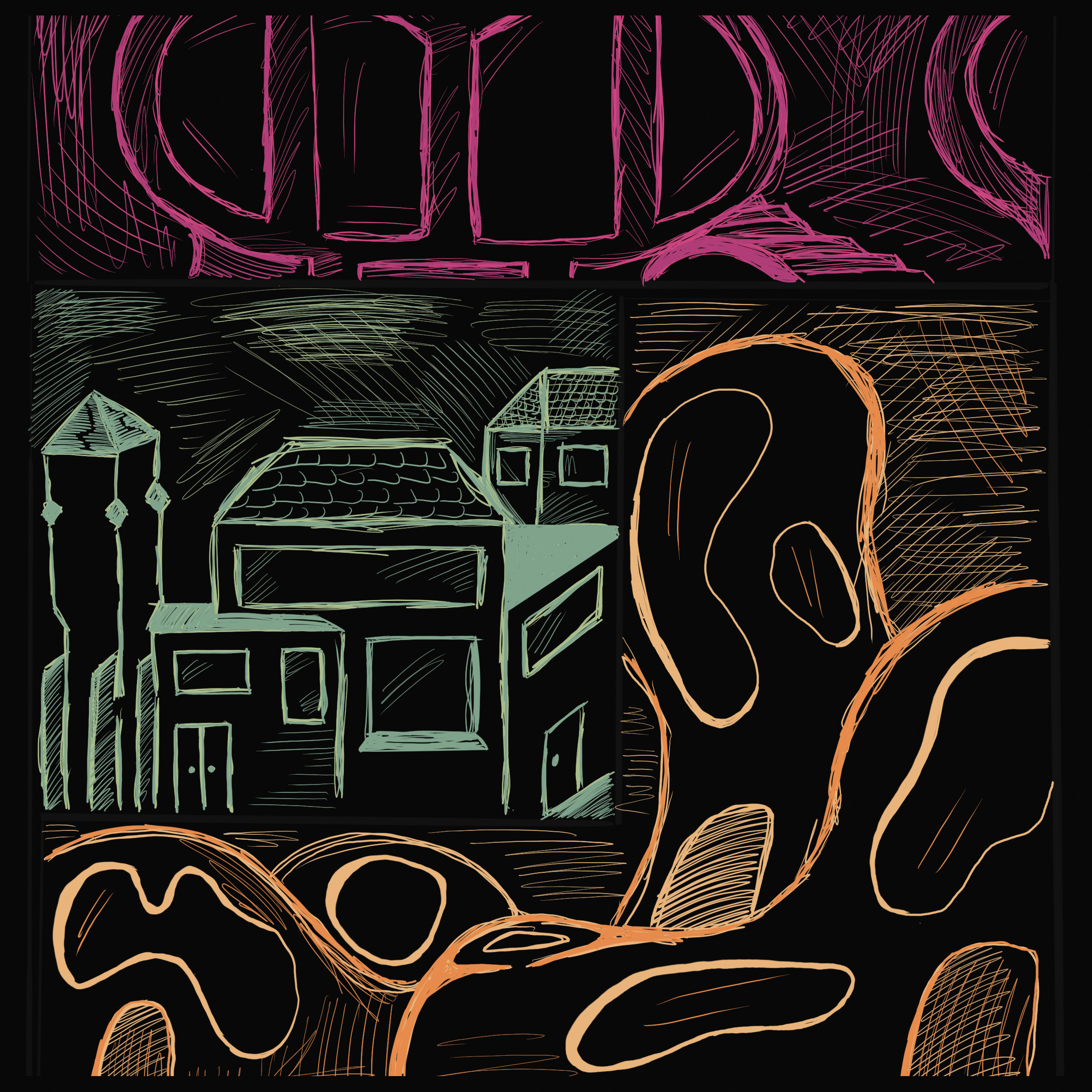
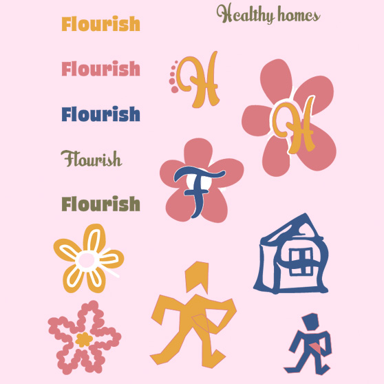
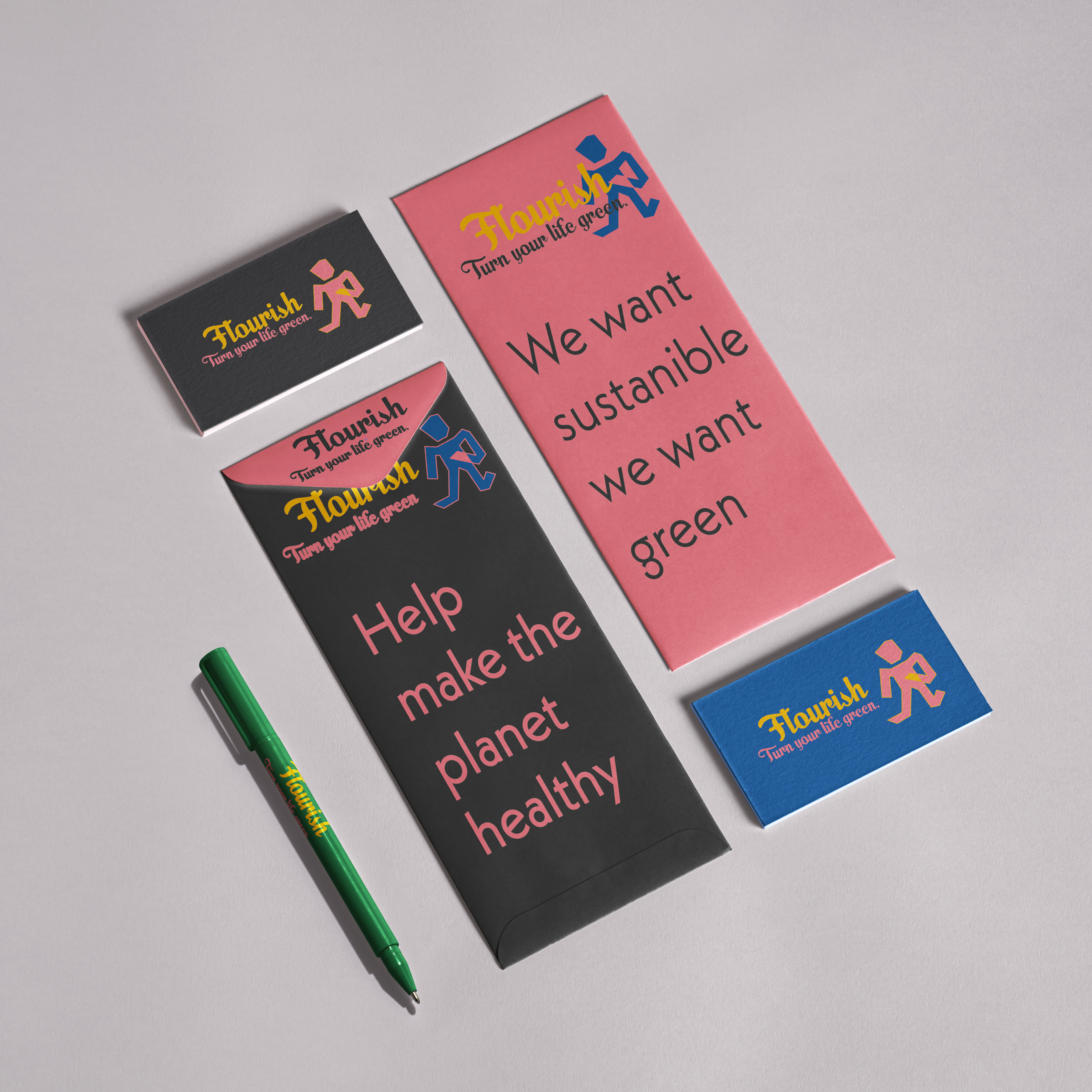
My first route for branding-
Flourish
With this branding strategy I aimed towards farmers to get them involved in growing crops for Hemp Homes. I also chose this name due to the idea of moving and 'flourishing' somewhere new.
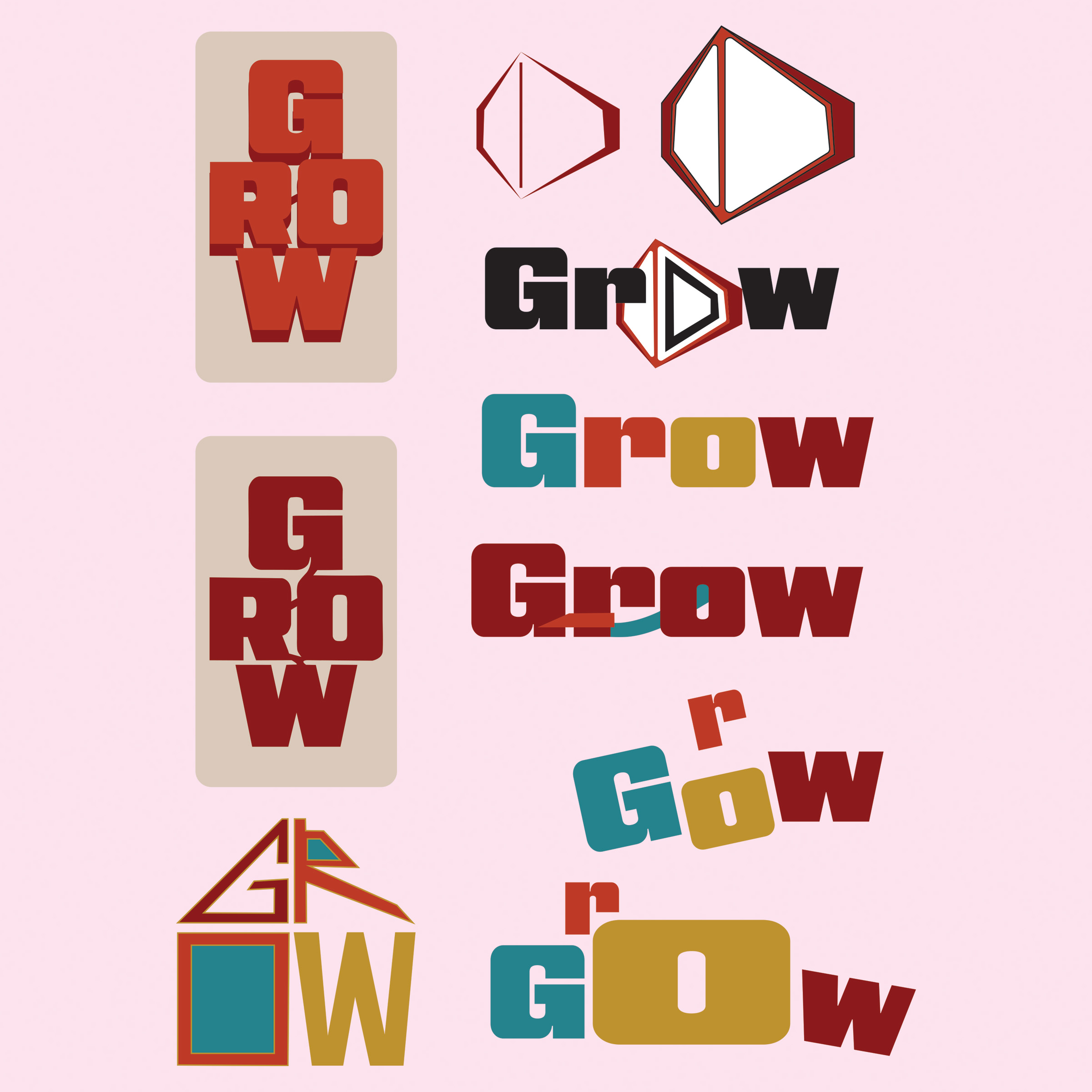
My Second route for branding-
Grow
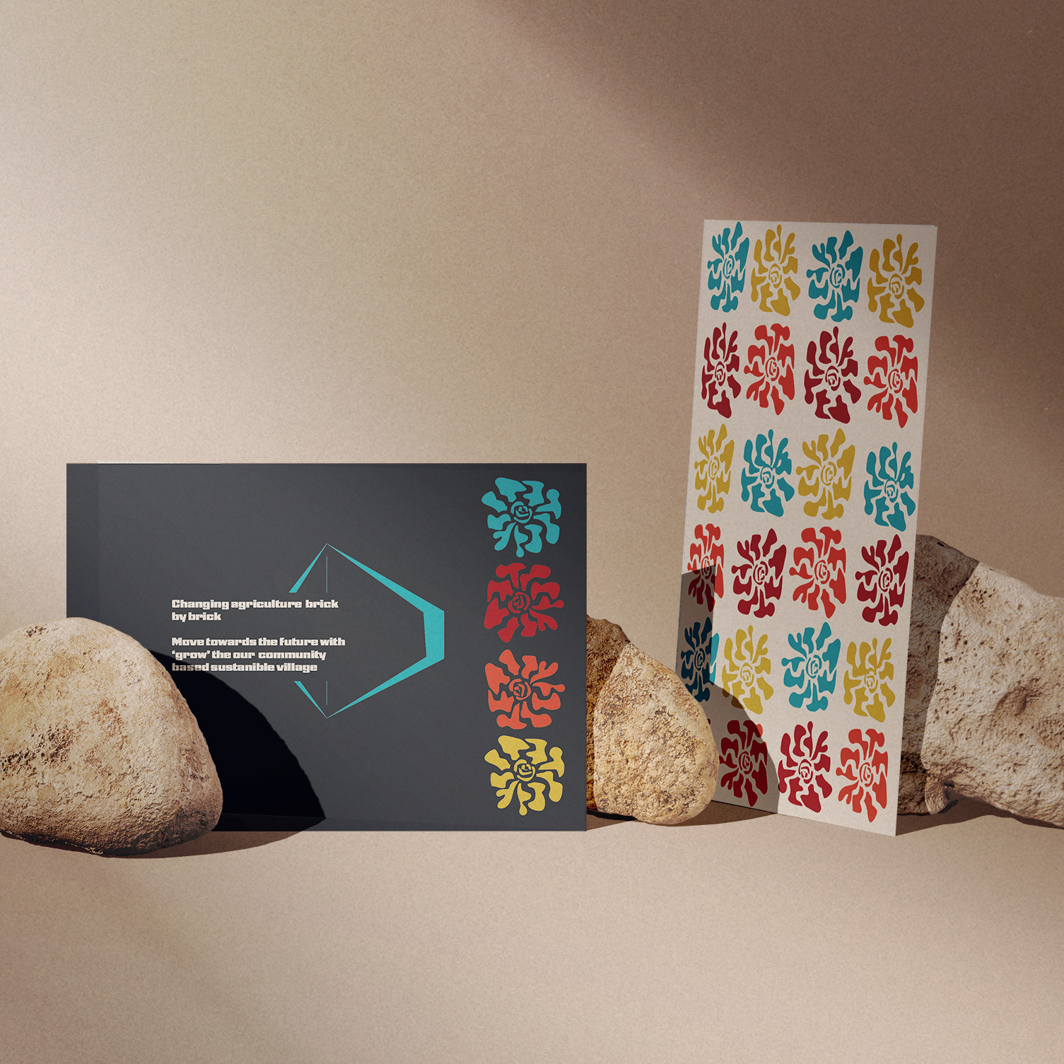
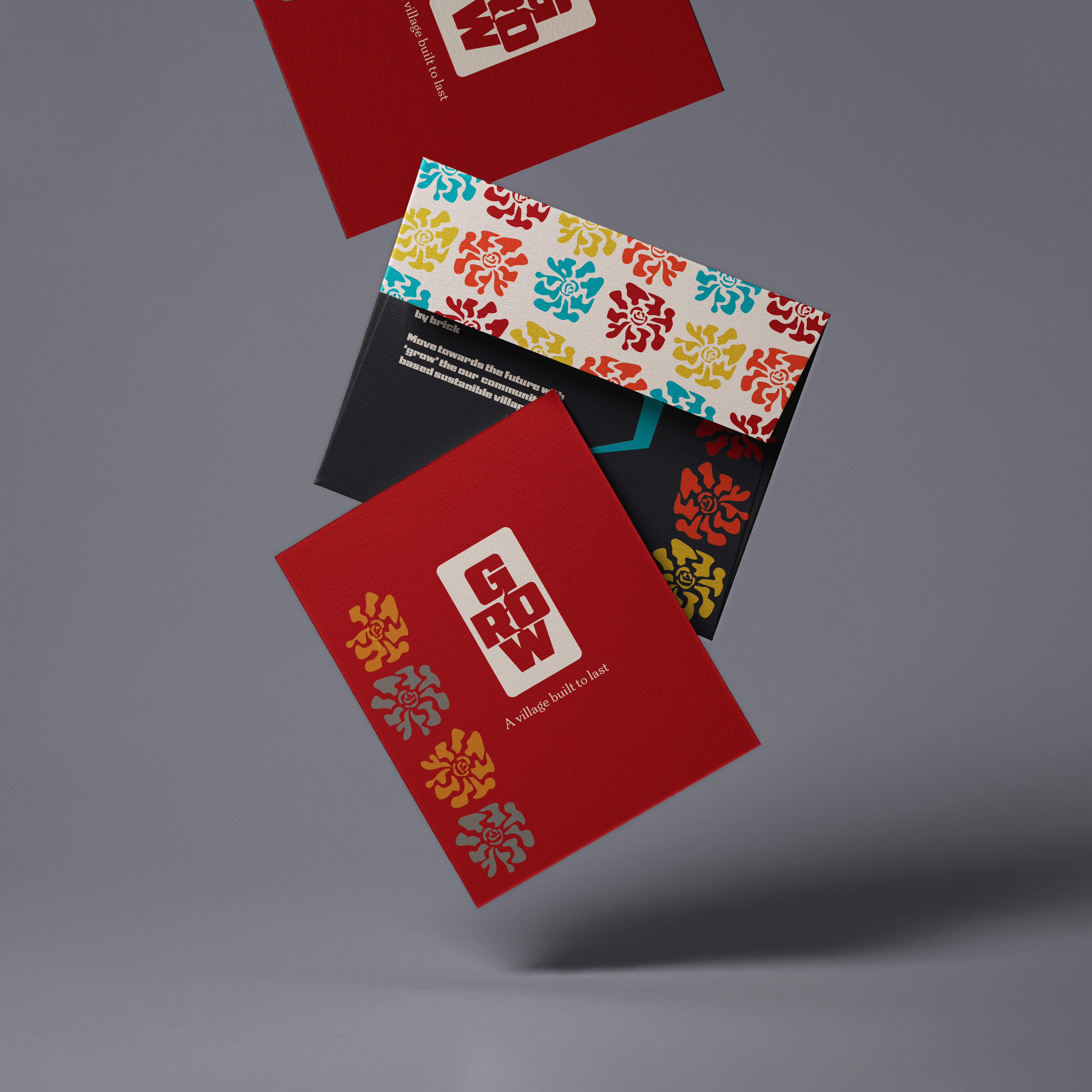
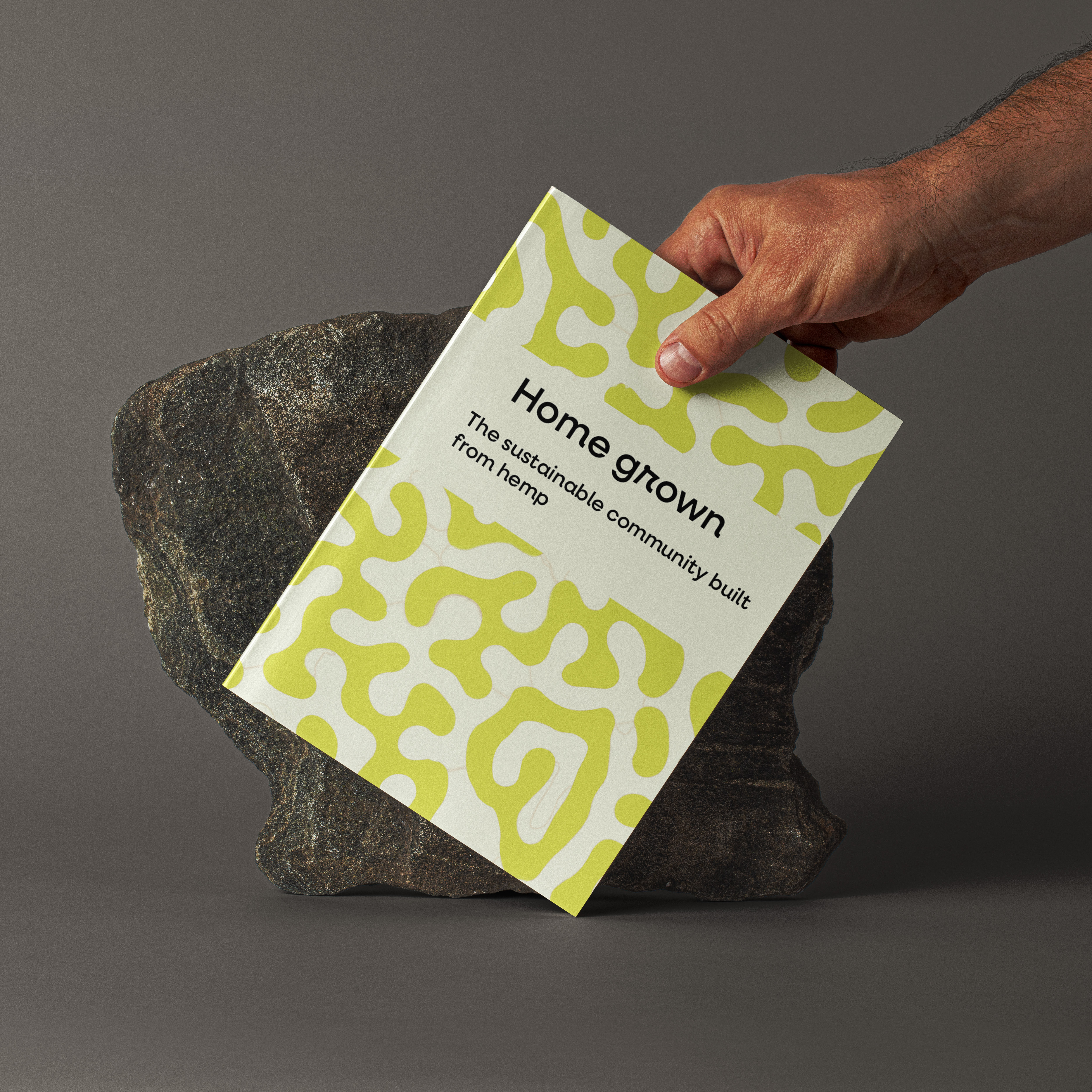
For Grow, I chose a flower pattern and bright colours, to draw attention. I wanted a mock up with an outdoor feel to connect it back to the Hemprete material, this was shown though rocks for building in this mock up.
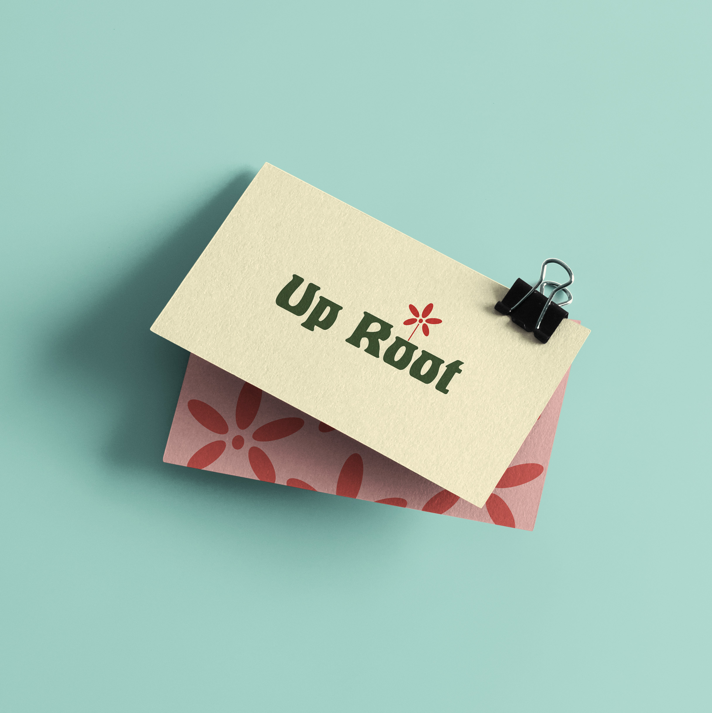
My final route that I put forward-
Up root
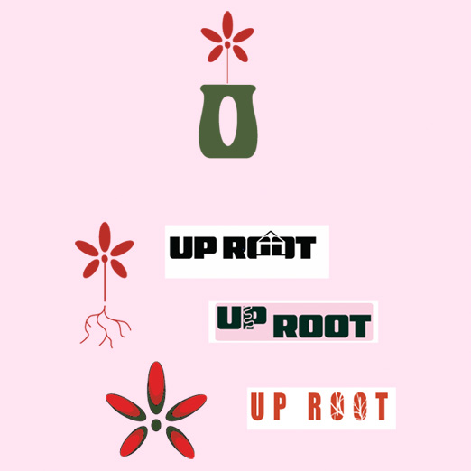
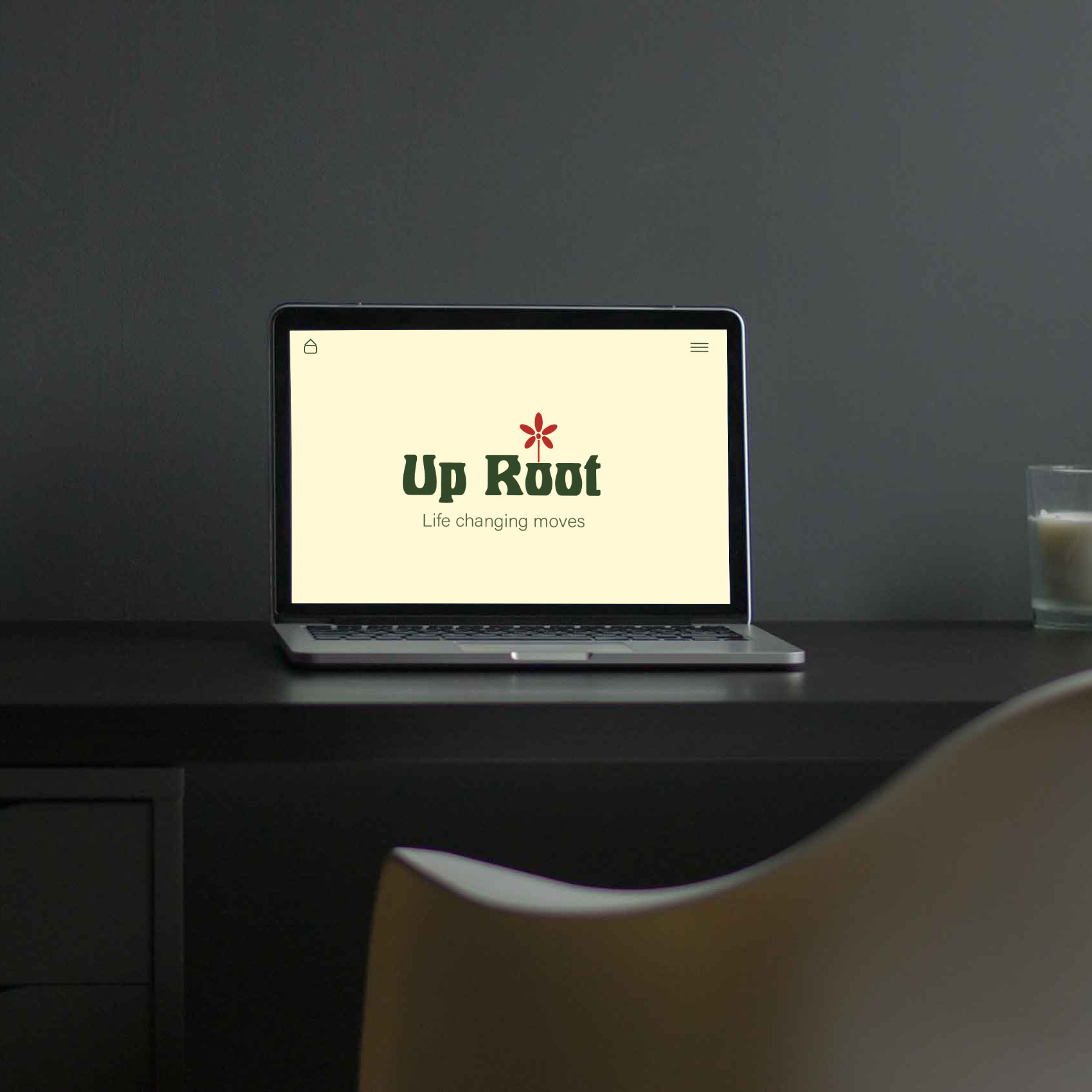
went with this idea because of the earthy greens, and the natural feel to the branding.
I love the ‘Up Root’ logo with the 'O' font incorporated into the plant pot. I think this gives the consumer an insight into what the brand stands for.

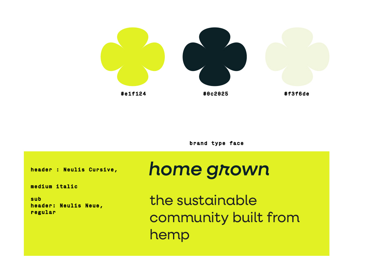
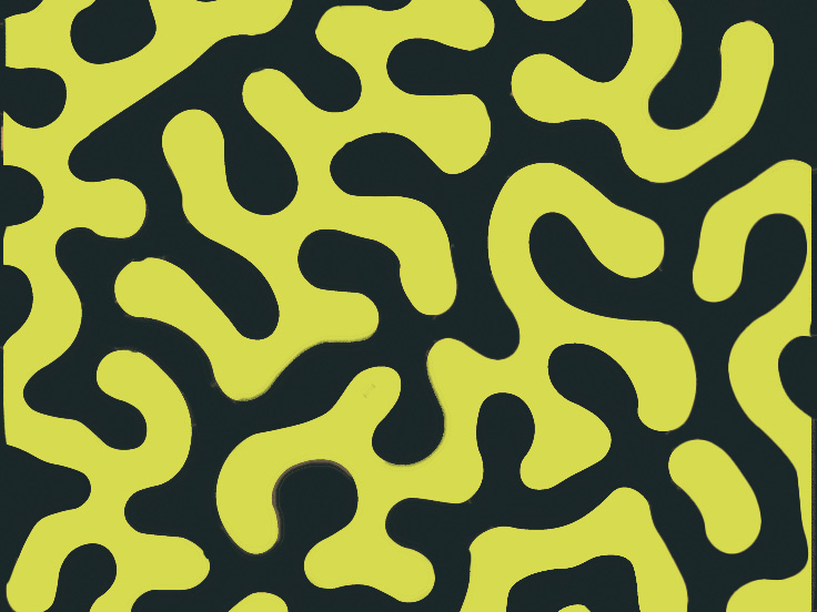
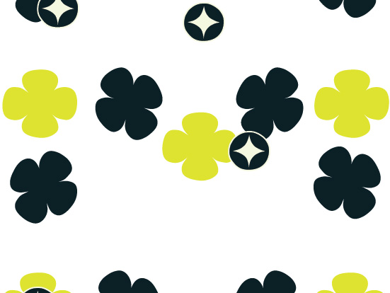
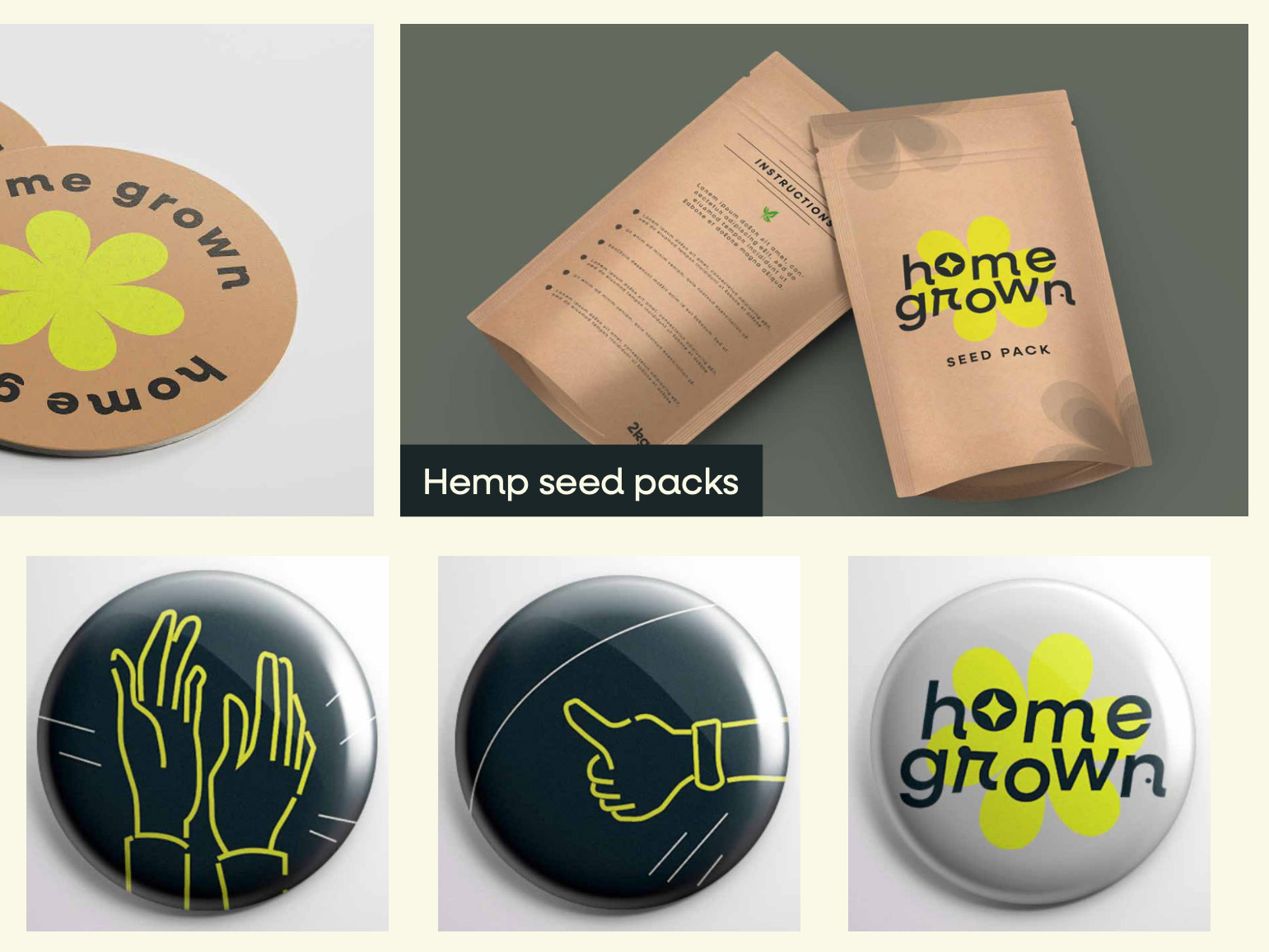
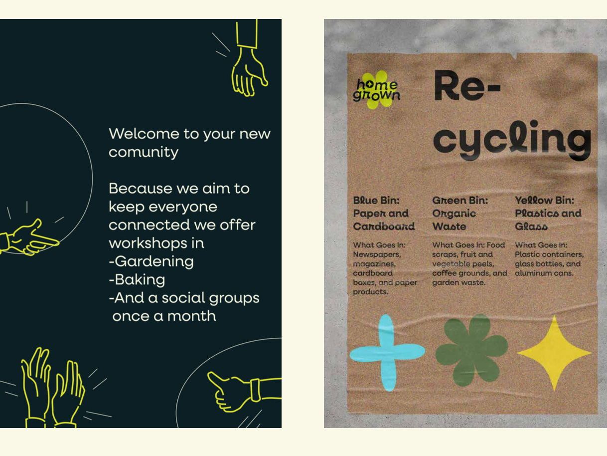
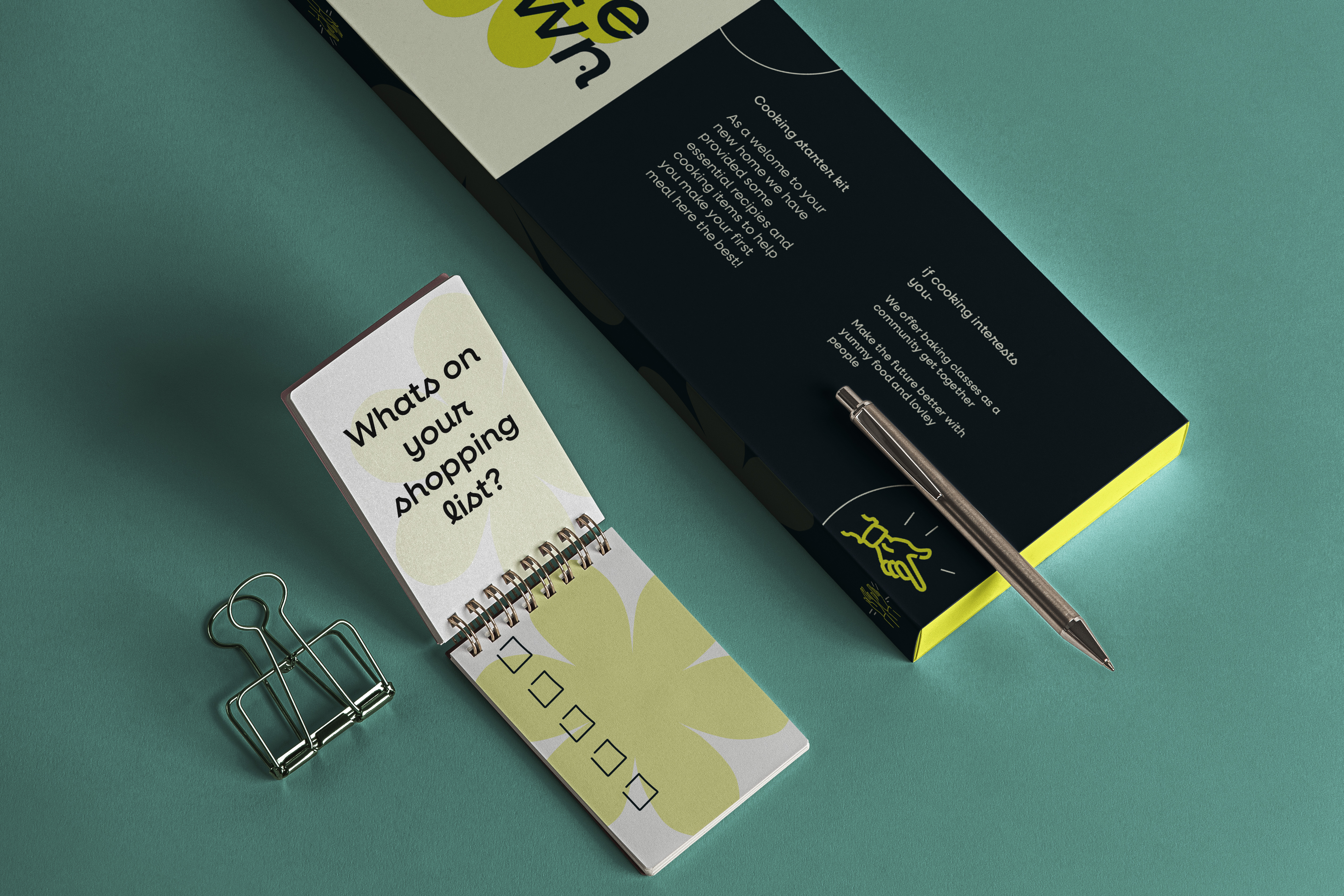
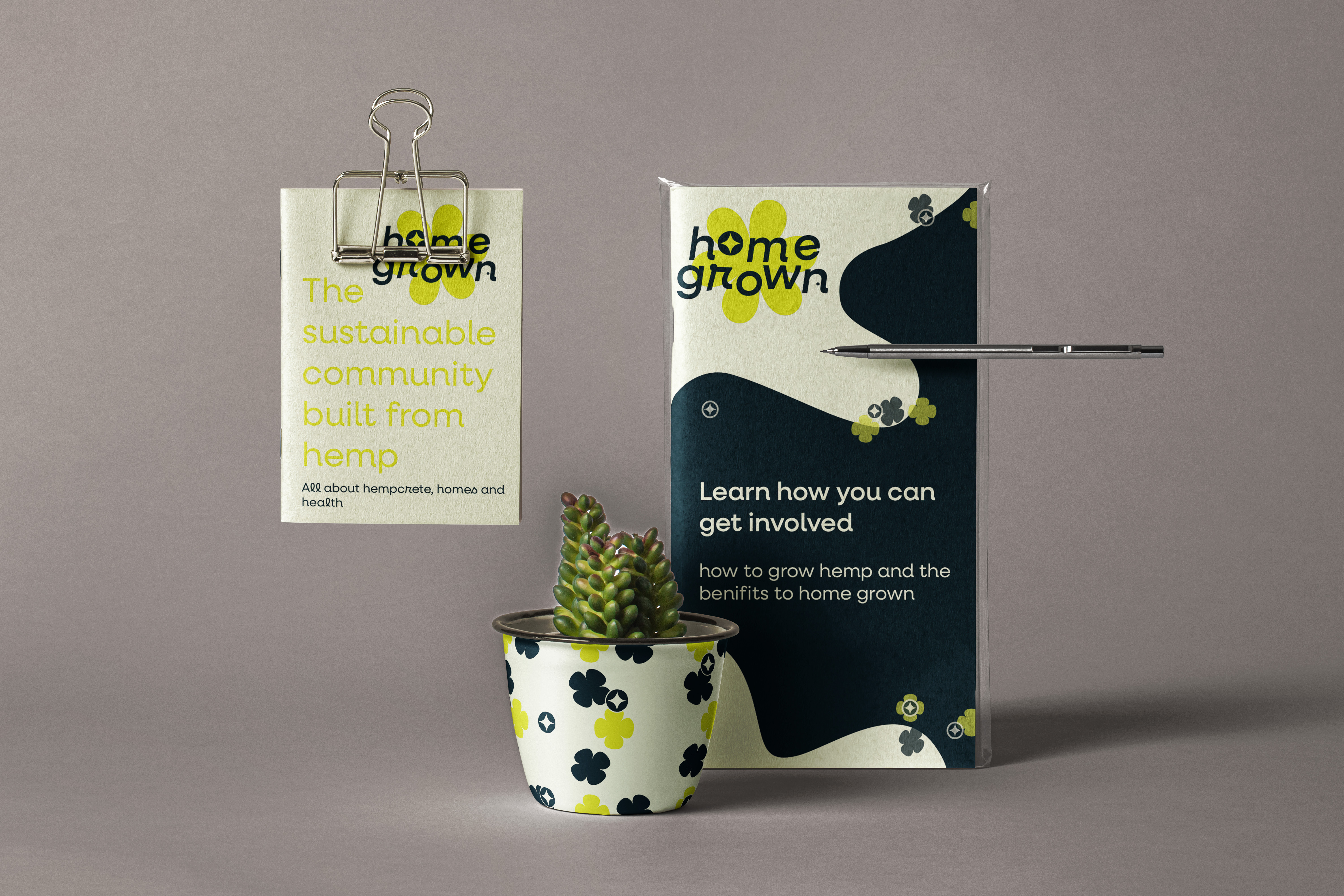
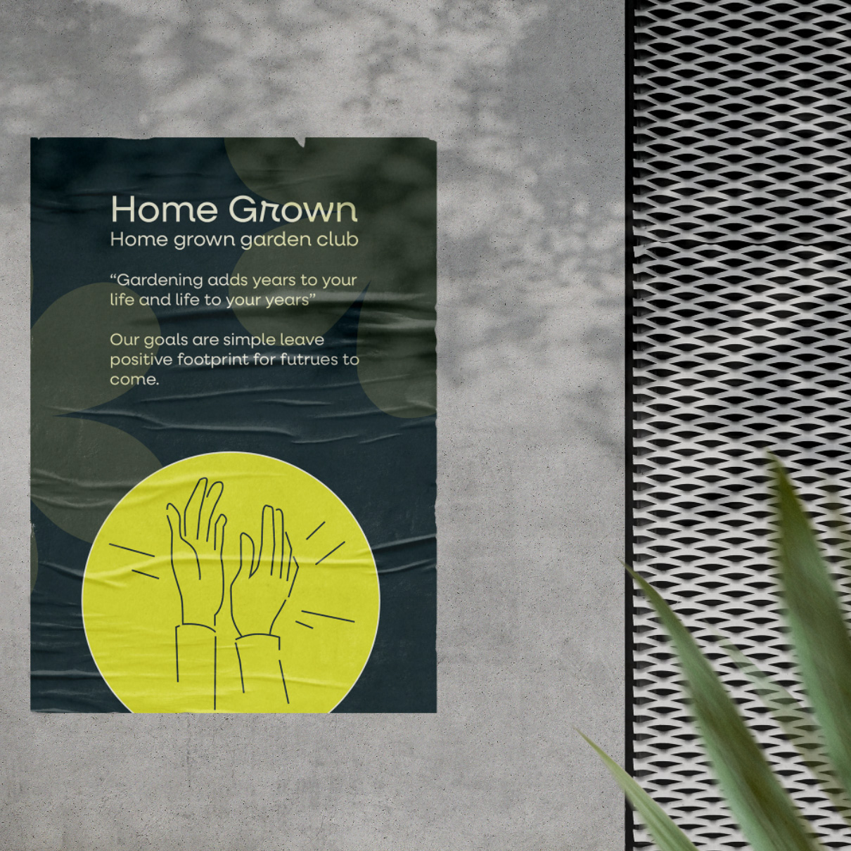
Finalising branding we choose 'Home Grown' as the brands name, based off the fact hemp can grow locally before being used to create Hempcrete.
Our brand strategy for influencing people to move here was the promise of healthier living, community and the re-imagined lifestyle.
Looking back at the experience
The final outcomes for 'home grown' were very rewarding, I was able to develop my skills from strategy, conceptual thinking and even presenting!
The project was really helpful when it came to building confidence in my ideas. Although my brand approach wasn't chosen to move forwards with the challenge, developing someone else design style is something I enjoy to take on.
The sustainable goal was accomplished in our idea and was given positive feedback by the clients which helped make me positive towards taking on more design challenges.
After pitching our final strategy and branding to Imagination, I think everyone in my group felt really accomplished. I enjoyed the opportunities that came with working on a live brief, this a project I was very proud of.